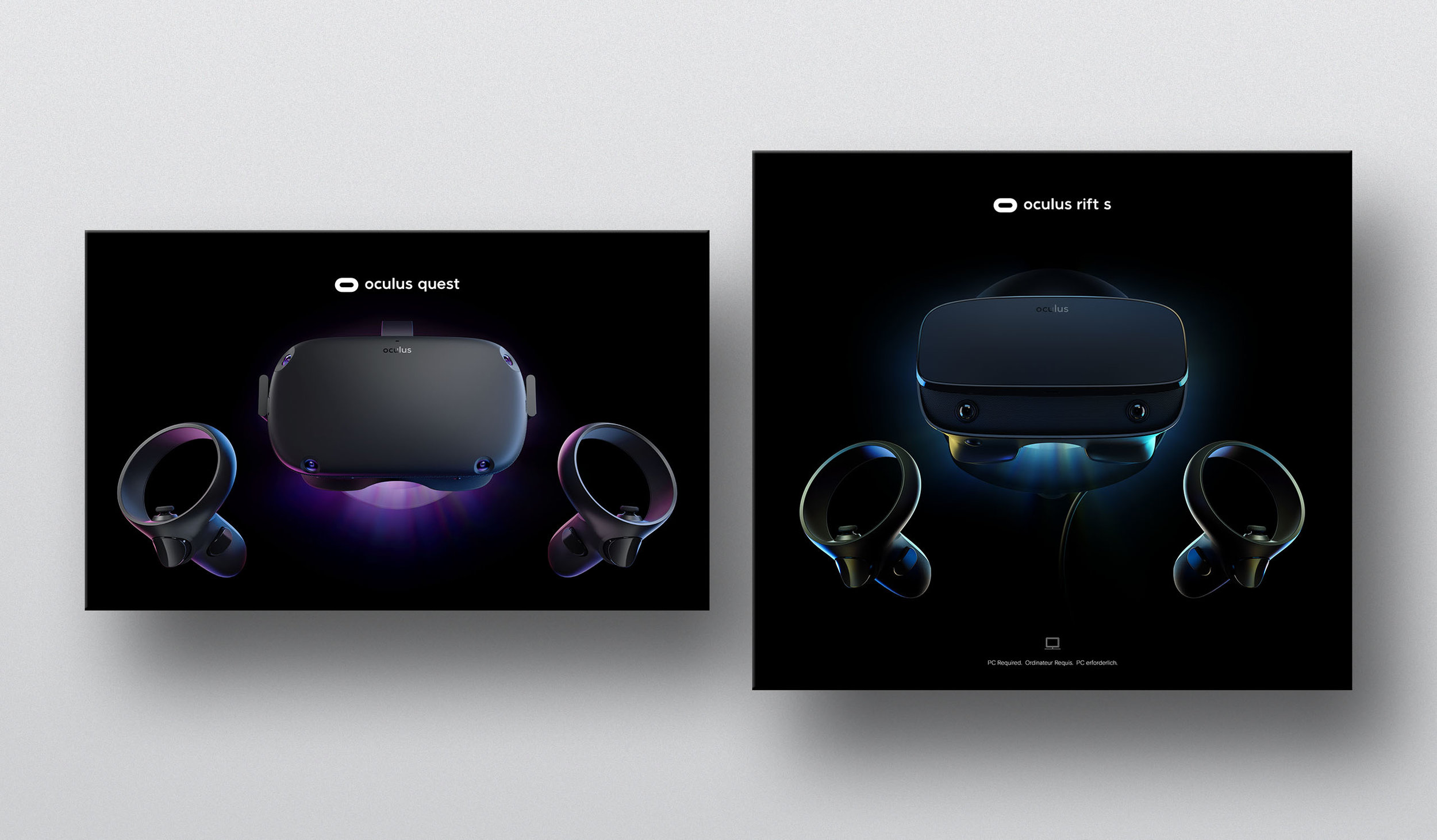
A refined visual identity designed to express precision, craft, and next-generation simplicity
I worked on this project with the Oculus brand/marketing team at Facebook AR/VR. The brief was to re-imagine the Oculus brand through a new generation of products as they would appear in advertising, packaging, digital and retail. The two new hero products launching were the Oculus Quest (a standalone headset), and the Oculus Rift S (a more robust tethered headset for PC).
The brand
We evolved the oculus logo mark to refresh the brand of these products, shrinking the left justified stadium to make it more compact, and maintaining type-weight continuity in the word mark across the product name. This allowed a logo that is more compositionally versatile to its surroundings.
Visual tone
To visually differentiate the Quest and Rift S, we explored a whole new color palette for the luminescence of each product - with magenta/purple for Quest, and blue/yellow for Rift S. We maintained the dark black background as a general visual unifier between the two. I was involved throughout the process - in charge of helping to guide the art direction of all of the product imagery, as well as the design of the information on all of the packaging.
This overall look and feel became the face of the new packaging for both of the products.
Accessories
Our brand system permeated out to 15 accessories boxes upon which we took a more muted approach - mainly to signify their more secondary and utilitarian function. Also some of the accessories work for both products, so this approach helped to keep some of them more generic.
Typography and scalability
We explored new typography for the brand, and updated from Oculus Sans to Basis Grotesk across digital and print. Localization was also a key consideration, so we built a simple typographic system that could scale across 3 languages and multiple sizes.


